The social media platform X was formerly known as Twitter. It carried over the legacy of its predecessor by enabling brief notes to be posted by registered users. A group of developers led by Jack Dorsey, Evan Williams, Noah Glass, and Biz Stone launched the microblog in 2006. Billionaire Elon Reeve Musk purchased it in the spring of 2022 and changed its name to X Corp, which is now its full legal name. Musk believes that the prior moniker and old concept do not match his vision for the web resource, as he plans to make it into an “app for everything.”
▶History of the X Logo 🌞
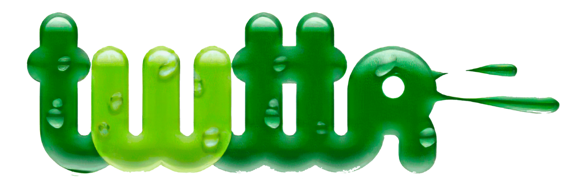
2006
This odd word appeared on the first logo since the social network was supposed to be called Twttr. The original emblem’s designer, Biz Stone, created a variant with a lowercase inscription in green. The letter “w” was painted in a light shade, while the remaining letters were painted in a dark shade. The font was distinct, with bouncy lowercase glyphs that were more hand-drawn than typeset. The designer added dewdrops to them for further effect, giving the lettering a alive, appealing appearance. This iteration functioned as a model for later signs.
2006-2010
The word “Twitter,” placed in a blue font designed by Linda Gavin, served as the company’s emblem at the time. These were soft contours, smooth curves, unfinished lines, and lowercase letters without serifs. They also lacked angles. The left portion of the crossbar was absent from the “t,” the “w” resembled an inverted capital “E,” and the “r” had a hook-like form.
Thus, using the bird as a model, Biz Stone produced a new image that featured a white eye, wings, a curved beak, and a pointed tail. Philip Pascuzzo, an artist, carried the idea through. After that, two further choices were put forth: a cartoonish and a minimalistic one.
2010-2012
The word “twitter” was part of this logo’s standard design. Its letters were rounded at the ends and bouncy. The new social network mascot, a tiny bluebird that was developed in its final form by Philip Pascuzzo and Douglas Bowman, was placed to the right of the inscription. A lengthy crest protruded from its crown, giving the symbol a more informal feel. The black-and-white figure was swiveled to the right, signifying the user’s brief communications, or “tweets.”
2012-2023
Martin Grasser, a former Art Centre College of Design graduate who later worked at the West design company, created the new symbol. He improved the bird’s image:
He flipped it to the top, took off the cres, cut the tail shorter, and shifted where the wing feathers were located.
Although the young artist got the intended outcome, just twenty-four of his roughly one thousand drawings were accepted. Jack Dorsey was shown them, and he selected the version that is widely recognised. The microblog proprietors intended to keep just the bird in the emblem and had given up on the name, which is why they were so meticulous. It was pointing upward, signifying freedom, expansion, and endless possibilities.
2023-Present
The social network’s name was quickly changed from Twitter to X after Elon Musk took over, as seen in the logo. The adorable bird took off, carrying with it the notion of “chirping” and “tweets.” It was replaced by a single letter that typically held classified information. It’s akin to a mystery mark because nobody can predict what the new owner of the online resource will do. He did, after all, imply that this insignia is only transitory and that others will follow. The glyph has two legs: one slender and parallelogram-like, and the other wide.