Volkswagen is a renowned brand of automobiles that the German Labour Front founded in 1937. The corporation is the biggest carmaker globally and among the most prosperous mass-market automobile brands. The German translation of the Volkswagen is “car for the people.” The trademark originated from an idea conceived by Adolf Hitler. His goals were to construct a motorway and lower the cost of cars for the general public. Hitler visited a Berlin motor show in 1933, which gave rise to the concept. After taking office as Germany’s leader a year later, Hitler asked Ferdinand Porsche to start making “people’s cars.”
▶History of the Volkswagen Logo 🌞
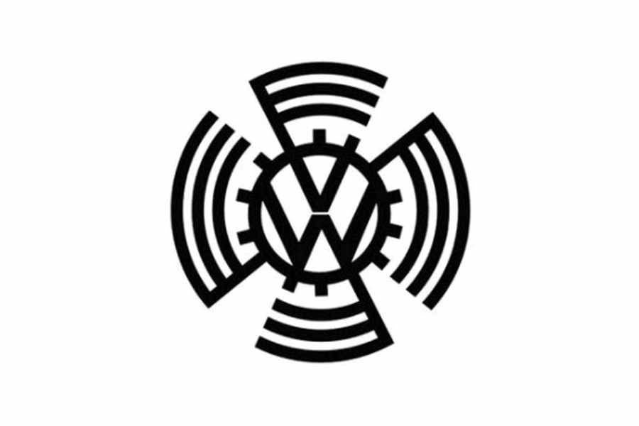
1937–1939
The initial brand’s emblem consisted of the two characters, “V” and “W,” stacked on each other and surrounded by a cogwheel frame. It was a rounded, graphic rendition of the Swastika.
1939–1945
Two years later, a new logo was created. While the Nazi iconography has vanished, the writing and cogwheel are still there. The new logo has more balanced proportions and is tough, manly, and practical.
1945–1948
The brand’s most enduring logo, which served as the basis for the current logo, was established in 1945. It is stronger and more graphic and emphasises the product’s quality and usefulness.
1948–1960
1948 saw a modification of the Volkswagen emblem that bolded the roundel’s inside shape and reduced the space between the letters “V” and “W.” The monogram’s colour scheme was also changed to black and white. The German carmaker used this version of the badge for ten years.
1960–1967
The distinctive square logo was created in 1960. Maintaining a brand’s worldwide reputation was intended to help it enter foreign markets. The strength and solidity of the brand were reflected in the square frame of the new VW emblem, which used a monochromatic colour scheme.
1967–1978
After seven years, the square has vanished, returning the trademark circle to its traditional form. The design of the new logo was similar to the one from 1945 but more basic and elegant. The colour palette was modified to blue and white, presenting the blue characters on a white background.
1978–1989
The logo form was significantly adjusted by doubling the frame, and the letter “V” got slightly smaller. The colours were changed to match the current logo, a white sign set against a blue background.
1989–1995
The alterations of this historical period were primarily about the colour palette. It’s still white and blue, but the blue has brightened and lightened. A slight alteration was also made to the proportions.
1995–1999
The famous badge was given a new shade of blue in 1995. It was made much darker and smoother than the one used for the previous iteration, giving the entire emblem a more severe and polished appearance. Volkswagen utilised his shade for nearly five years.
1999–2000
The 1999 makeover gave the Volkswagen badge more dimension, added gradient shades to the roundel’s blue background, and cast a soft shadow over the characters’ white lines. This was a stand-in symbol for the three-dimensional one that was unveiled a year later, replacing the flat one.
2000–2012
The new logo was created in three dimensions. The blue colour intensified and became calmer, while the white colour took on a silver tone. Now, the dimensions are exactly right, and the logo appears strong.
2012–2019
Even though an emblem’s size has decreased, the new logo maximises its 3D effect. Sharper and bolder letter lines offer the logo a robust and assured appearance, conveying a sense of advancement.
2019–Present
The brand’s most enduring logo, which served as the basis for the current logo, was established in 1945. It is stronger and more graphic and emphasizes the product’s quality and usefulness.